Here are DC Comics’ November solicitations, which includes issue #2 of He-Man/ThunderCats:
Here’s what the He-Man/ThunderCats logo looks like:
I like it although I would prefer to see the Thundercats logo on top :liono
I noticed that the ThunderCats logo on the cover is a customized DeviantArt piece made by therickhoward:
http://www.deviantart.com/art/Thundercats-Logo-25888145
I’m impressed that DC was able to use his version of the logo. 
Just pre-ordered issues #1 and #2 plus the COLORING BOOK variant of #1.
The cover art for #2 looks pretty nifty Though it looks A LOT like Scott Campbell’s ThunderCats…
http://www.he-man.org/assets/images/home_news/dc-heman-thundercats-crossover2_full.jpg
I’m not really feeling the colouring style used on this cover. It’s very muddled and busy to my eye. Is this representative of the whole book or just a stylistic choice for the cover image?
I much prefer the style of colouring of the top image. Though I do wish the top image had some of the stronger black outlines of the bottom one.
Here’s a really quick photoshop combo of the two styles:
I like your version of this image, Booshman. The way you combined the previous two just makes it even MORE epic than before!
I like what you have done there!
Out of the original two I do preference the foreground of the secon and the darker background of the first.
I really don’t like this art style that the makers have chosen. Why not just go with the more conventional comic art style? Everything is so overly curvy and curly!
I think they did it that way for one main reason. Its all due to the fact that MOTU came out first in '82, while Thundercats didn’t come out til '85. I love both franchises equally, so it doesn’t matter to me which one comes first in the title. Same goes for all the various Transformers/G.I.Joe crossovers over the decades.
I wouldn’t be the biggest fan of the art style either but at least it’s different from the usual drab art that fills most comics.
Here’s the cover art for issue #3 of He-Man/ThunderCats for December:
I wonder why all of the Thundercats eyes are white…
Except WilyKat’s. :wilykat
I was too busy salivating over the awesomeness of Skeletor fighting the Thundercats to notice the eyes. Hoping for #4’s cover to be Mumm-Ra fighting He-Man, Teela, and Man-At-Arms.
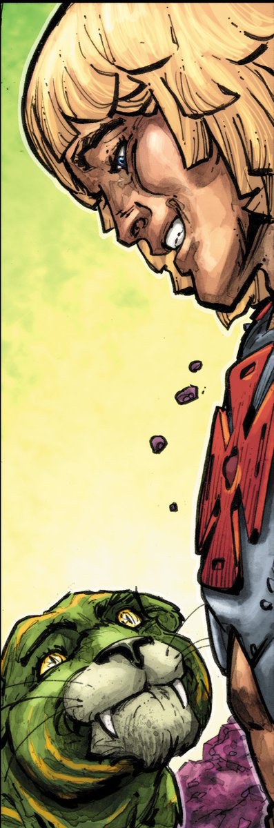
Here’s a sneak peek of He-Man and Cringer from the crossover, as posted by DC Comics editor Jessica Chen:
IGN have a very nice preview of it…
I would like to see some two packs of this…
I read and enjoyed the sneak preview. I will definitely be picking up the new crossover comic.
I plan on getting it as well!